In this tutorial, we will go through the steps to create a retro 1960s psychedelic concert poster. This tutorial relies heavily on the use of the Warp Tool, but includes a few other techniques as well. Let's get started.
Step 1
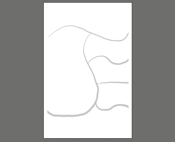
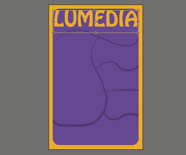
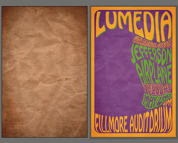
Create a new document with a poster-like size ratio. Visualize how you want the document to be laid out and draw some rough guides with the Brush Tool (B) on a new layer called "guides". I drew several different compartments that will each contain a different piece of text and one that will contain an image.
Step 2
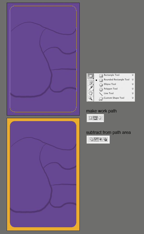
Make a solid color adjustment layer and fill it with a deep purple. Select the Rounded Rectangle Tool(U). Set the radius so that you get a nice rounded edge that you like. Make sure that you set Make Work Path As Checked on the property bar. Now click and drag to make your border. Grab the Pen Tool (P), and while holding Command, click and drag to select the path. Then click in the Subtract Path button on the property bar. Then make a solid color adjustment layer and fill it with an orange color.
Step 3
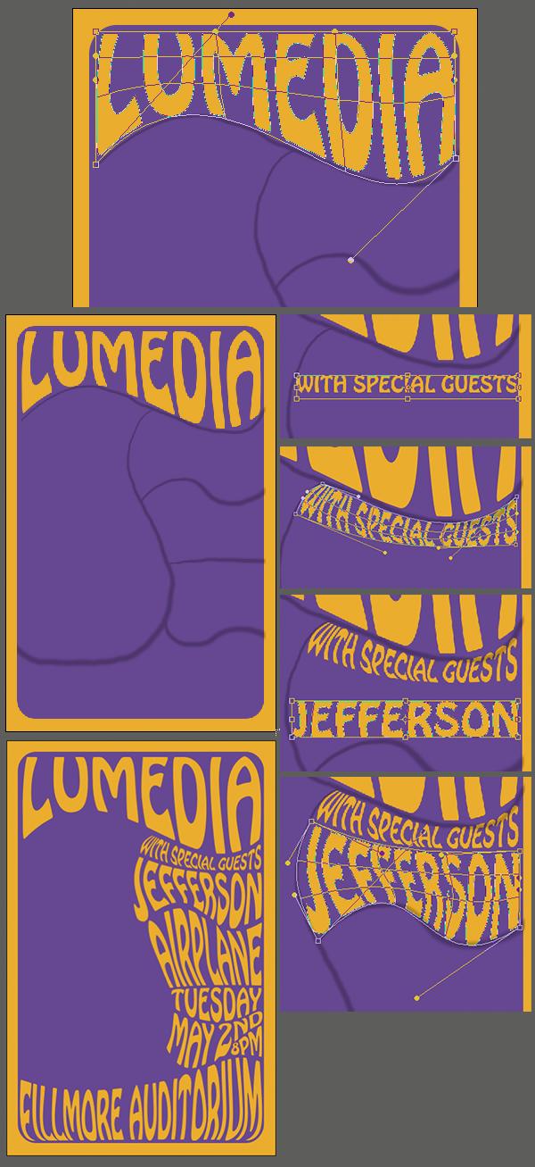
Now to set the first bit of text. I used a font called Hobo Std for mine. Grab the Text Tool (T) and click anywhere in the canvas. Then type your text. Hit Command+T and scale the text up so that it fits the first compartment. Hit enter to set the transform. On the Layers Palette, right click on the text layer and select Convert to Shape. This turns the text into paths.
Step 4
Go Edit>Transform>Warp and warp the text to fit the compartment. I find it's easiest to start with the corner handles and then adjust the others afterwards. The Warp Tool can take some getting used to, though it's fairly intuitive. Play around with it until you get a good result. Repeat this step for all the text compartments.
Step 5
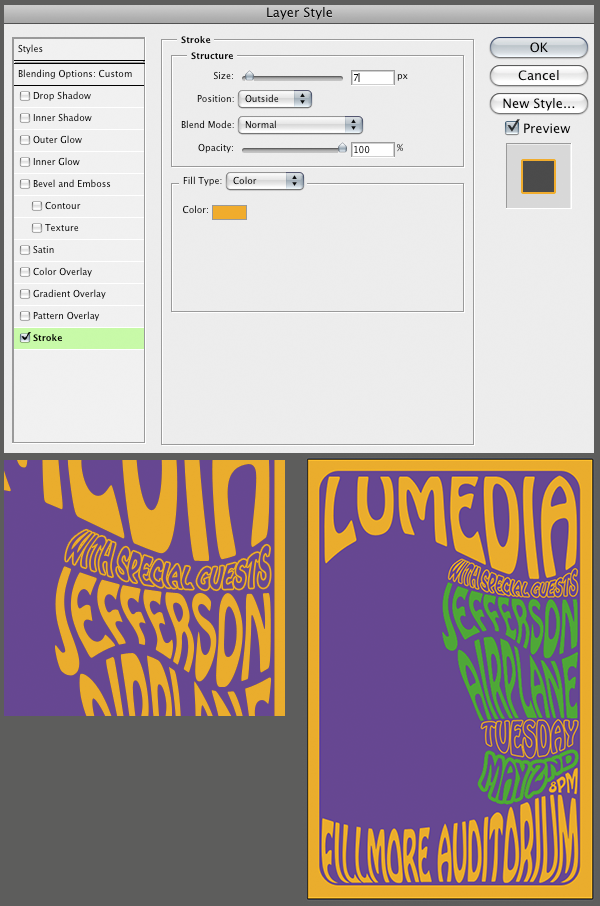
Now let's go back in and change the color on some of this text. First, I want some of the text to have a stroke. Make the fill color on the 'with special guests' layer white. Then set the layer's blending mode to Multiply. Double-click on the layer to the right of the layer's name to open the Layer Styles Palette. Give the layer a stroke with the settings below. Go ahead and change the colors on the other text to whatever you like. Also, apply a stroke to some of the other text.
Step 6
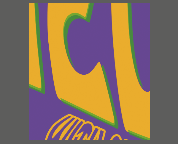
Many of these old posters were screen printed. Lets give ours a little of that effect. Load the selection of the 'Lumedia' layer by Command+Clicking on its vector thumbnail. Hit (M) for the Marquee Tool. Then hit the arrow keys to move the selection down and to the right. Now hit Alt+Command+Click on the same layer thumbnail to subtract from the selection. Make a new solid color adjustment layer just above the original text and fill it with your secondary color. Set the Opacity to 75% and give it a nudge so it doesn't line up correctly. That way it will look more handmade.
Step 7
The thing that is really going to make this look good and realistic is some texture. I have a paper texture that I got from BittBox that will do nicely. Copy the texture into the document. Then put it at the top in the Layers Palette. Set the blending mode to Linear Light and set the Fill to 25%.
Step 8
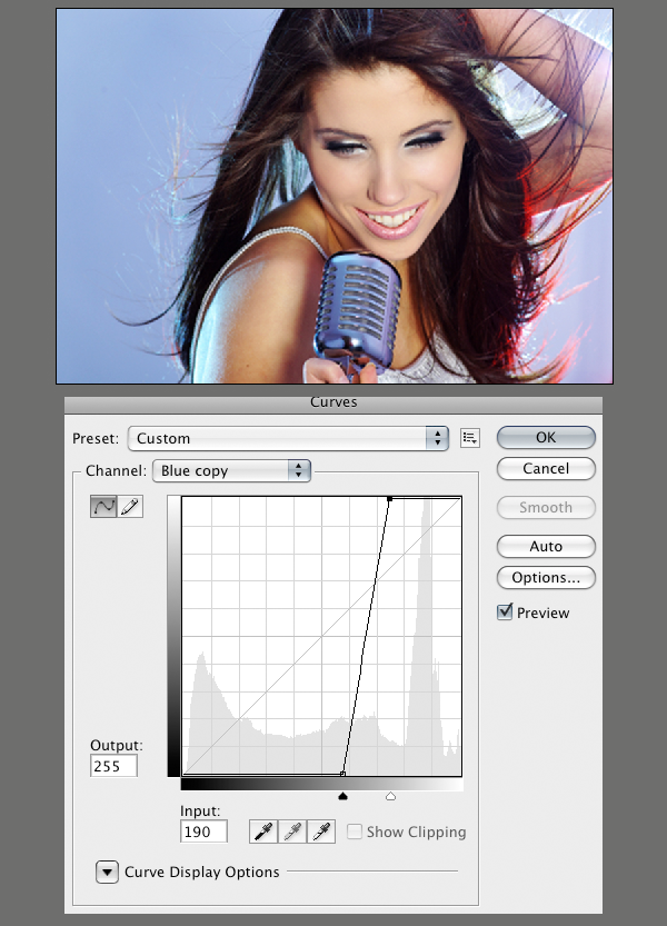
Now let's move on to our image that will fill the rest of the poster. I got an image of a female singer from iStockphoto. Duplicate the blue channel by dragging it to the New Channel button at the bottom of the Channels Palette. Apply a harsh curve to it that looks something like below. Do the same to the red channel. Now invert each of the two new channels you made by selecting them and hitting Command+I.
Step 9
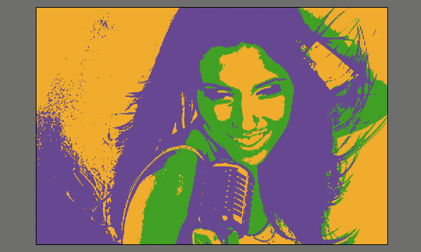
Make a new Solid Color adjustment layer and fill it with the lightest color that you used in the poster. Load the selection of one of the channels you made by holding Command-clicking on its thumbnail in the Channels Palette. Make a new Solid Color adjustment layer above the previous one and fill it with one of the other colors from the poster. Do the same with the remaining channel that you created and fill it with the remaining color from the poster.
Now on each of the masks on the solid color adjustment layers, apply a threshold. Go Image>Adjustments>Threshold and drag the slider until you get the detail that looks good to you. Do the same for the other mask on the other color.
Step 10
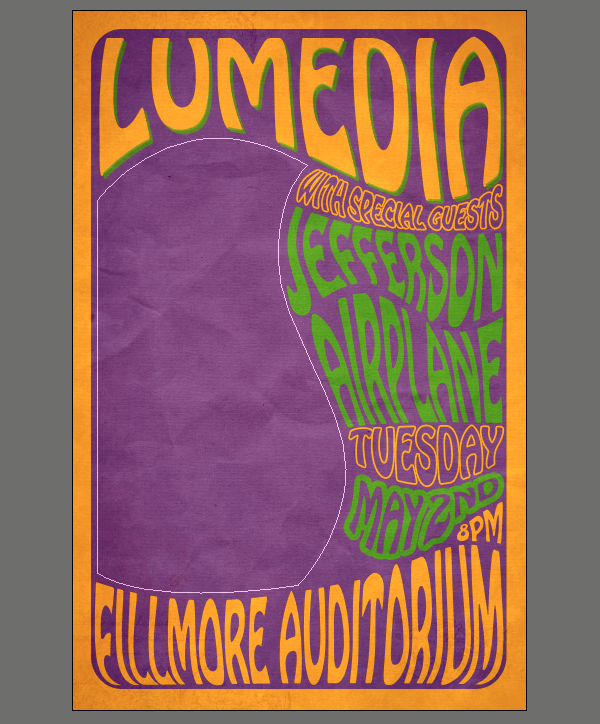
Now, let's get back to the poster. With the Pen Tool (P), draw a path around the blank area of the poster. Make a new group by clicking on the folder icon at the bottom of the Layers Palette. With the path highlighted, hit the Add Layer Mask button twice to apply the path as a vector mask.
Conclusion
Now drag the three color fill layers from the singer image over to the poster document and put them into the group that you just created. Scale the image to fill the space as you see fit. I flipped mine horizontally to make it fit better.
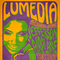
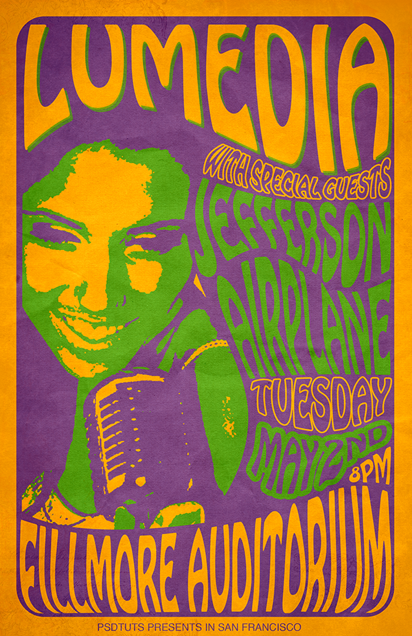
Our final 1960s psychedelic-style concert poster is below. Have fun with these techniques and this style of design.
0 comments:
Post a Comment